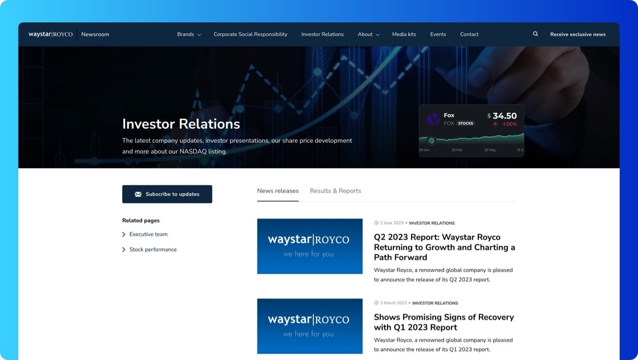
Two extra layouts for section pages & improvements
Sections are used to bundle and showcase related newsroom content. Most commonly, sections are focused on specific news topics or content categories such as company news, product updates, and industry trends. These section pages bring together tagged content and showcase the latest, limited results in distinct sections on a single page. This helps visitors easily find and read the latest content on topics they're interested in.
We've noticed that customers use section pages for various purposes too. Larger companies create pages for their sub-brands, agencies set up specific client pages, and some customers use them for blogging.
However, the current page layout isn't designed for all of these cases. This leads to suboptimal user experiences. That's why we are introducing two additional layouts.
These are the three layouts you can now choose for your section pages:
- (New) Sidebar with tabs: A two-column layout with a sidebar showing tagged pages and subtopics, plus a tabbed menu for news releases, clippings, media kits, and events. Ideal for complex topic pages, sub-brand or client pages.
- (New) Blog: Looking to run a blog in your newsroom? This layout lists all articles in a simple, vertical list optimized for search engines. All articles published in this section will automatically have a center-aligned design without a sidebar or press release specific functionalities.
- Default: A lightweight sectioned page that showcases a limited number of tagged content results in separate sections, one after another.
Each section gets its own layout so you can pick the best one for each of your pages.
To change the layout:
- Go to your newsroom settings and click the Sections tab.
- Right-click a section in the tag tree and click "Edit section" to open its settings page.
- Here, you can change the layout.

Other improvements & fixes
App
- Displayed logged-in user account details and active organization name in the settings flyout menu
- Migrated to the latest ChatGPT-4o model for PR.co AI Assist
- Improved the in-app upgrade interface and experience
- Renamed "Languages" to "Content Localizations" to clarify the purpose of this settings page
Newsroom
- Added Greek and Albanian as language options
- Reinforced aspect ratio of images inside the hero and news cards
- Improved empty states and icon alignment throughout the newsroom
- Improved the contact card design
- Fixed image size inside the contact section of Press Page (Safari)
- Fixed image size inside the weblink component (Safari)


